Wednesday, 18 August 2021

 And now it is 2021! We have lived with Covid since March 2020 including a period of total Lockdown. This period gave me the opportunity to stay at home and focus on being creative after 3years of frustrations and challenges. 

 I enrolled for India Flint's course to be part of a global community where we could establish a daily routine being creative and learning more about eco printing. I discovered purple carrots!


We learned different ways to fold the fabric squares and how the string can add interesting lines


We went out into the world discovering the treasures to be found on our doorstep, leaves, flowers; feathers to make brushes new ways to explore mark making. Recording what we saw or imagined


The daily diary is something very special and a reminder just what Lockdown meant and the terror of this threat to our lives. Later the books were sent to Australia for an exhibition of our work. We embroidered the cover with memories and reflections, mine has a halfpenny found at the farm, a euro for France and Sar, a badge from Sochels room, and a Mary Quant badge from the last exhibition Maria and I went to before Lockdown. Our days were filled and we were able to share our experiences and our achievements with others on the course from all over the world.  What an amazing person India is!!


The anticipated sale of the farm still has not completed and this has drained me so Lockdown, for me was a joy , a real chance to develop Colour Naturally and look forward to new opportunities and discoveries! 

Friday, 26 January 2018

2018
What a lot has happened and nothing related to my love of textiles but I need to return to my creative space so much has caused me to look back and remember the past now I want to start to make room for looking forward. There are two projects that I hope will enable this to happen.

Spring means the opportunity to look at the garden and plan for dye giving plants. So research into seed sources for the plants missing from my garden.


Snow has gone and the garden and forest are waiting for me to get start

Get into the greenhouse and start sowing!!


France and the house which could offer me the chance of my own studio designed for my practice and the beginning of a dye workshop in France. Initially to design and produce cards with colours from locally sourced dyes.
The garden in France with potential!


Friday, 29 July 2016

MASTERS SHOW 5th to 10th AUG

It always takes longer than you expect! The double sided tape couldn't cope with the 35 degrees of heat and there was a line missing from the booklet. But the Show is up!!
All problems sorted and I hope that when I go on Monday to do a final ironing session and wash the scarves that everything is in place. My Show space is much better than I had initially envisioned and that's largely due to the experience of Fine Art tutors who 'do not display as much stuff as textiles'! So I have a larger area and that means that you can appreciate the individual pieces also with the help of our wonderful ladies in the Textile office displaying the pieces has been more successful. How I envied George whose work was on vinyl and upholstered sofa and chair when 2 men just spent an hour 'papering' the walls and the floor space lifted the furniture into place and that was it!! Her work is at the other end of the textile spectrum (if there is one) to mine and I think we respect each others professionalism!
The outcome of the Show may determine my enthusiasm to set up links for talks, demonstrations etc! Also the lack of response (which I think is rude!!!) from Elvedon, the Dean and the Heritage Officer has dampened my enthusiasm.

So watch this space but for now a Show I am proud of!!


HAND WOVEN COTTON SCARVES DYED WITH BLACKBERRY, WOAD, EUCALYPTUS AND INDIGO OVER WELD


SILK SCARVES INCLUDING RUST ECO PRINT


Monday, 18 July 2016

INDIGO

I still am in awe of Indigo dye vats. Sometime ago I bought a water heater to make up a new dye bath with woad pigment from Ian Howard at Woad Inc. The recipe I follow is from Ian ie 9.5 litres of water. Washing Soda dissolved in 1/2 litre of water. 10gms of pigment in with the Soda and added to the heated water. 10gms of Hydros added and mixed gently. I actually know it off by heart but the actual chemistry of indigo takes a lot of understanding. The Hydrosulphate releases the pigment so that it will lay onto the fibre but when you take the fibre out of the dye bath it is the oxygen in the air which changes the green colour of the dye bath to the blue of indigo. I wanted to dye one of my final pieces, some scarves and a dress for my daughter so needed more volume. Would adding another 9.5 litres of cold water affect the dye bath well there was only one way to find out! Yes it worked. I am so pleased with the results as well.
To the glory and diversity of indigo. Women in Afghanistan

And one of my efforts using wax resist.
And when I went on one of Ian Howards workshops. I learn something new every time


Tuesday, 12 July 2016

Almost there!!

A week away to write the Critical Evaluation and a family wedding followed by college reunion was a good break away from dye pots!!
The CE was interesting and gave me the space to look back at the ways this project has developed changed and ended in a place that I feel comfortable. The booklet and working in collaboration with George has been so worthwhile. The end product isn't perfect but is a useful tool for future plans to present my work to various audiences. It will be difficult to make it pay for itself in sales but I need to consider it as a loss leader which, if successful could lead to profit.
                   
                                           COVER DESIGN  for COLOUR NATURALLY
So I have 4 large pieces all needing something small like stitching to complete and I am pleased with the outcomes after all these weeks. I feel that I was able to make decisions with the knowledge I have built over the last 2 years. The final 4 are all different and I think that shows a broad understanding not only of the dyeing process but also eco print with iron wax resist and the colour potential.

HANGING 1 - THE FIELD : WINTER SUNSET


I am pleased with the colours here and this shows the development from design to resist to final outcome.
HANGING 2 - THE FIELD : SPRING SHOOTS


Monday, 27 June 2016

In search of grey

Working on the final pieces has been a challenge and achieving the grey colour in my samples impossible. Analysis of the process has led to me doubling the strength and the immersion time but the outcome is no way near as successful as my sample. The sample on the left is the 'cold' grey that I want to reflect my observations of the field on a snowy day. The larger piece on the right is 'browner'.

I am staying with friends for a week and will use this time to write my first draft of the critical evaluation and reflect on my designs. Do I persevere or do I develop my next design following the seasons and the new growth in the field?

Monday, 13 June 2016

Booklet and challenges

After changing my direction from product to presentation many new pathways have opened up to my Masters.
One of those is a booklet. I contacted the local authority to identify who was in charge of the museum and heritage of the local area. A visit to a local heritage site, another to a shopping complex which also organises special events for members led to an explanation document to outline services I could offer ie talks, demonstration, workshop, exhibition etc. But I felt that I needed something more professional and thought out. My primary objective is to share my passion for natural dyes and inform people of the importance of sustainability. so -Historical evidence, My research, Dye colours and plants, The processes and The design development.
At NUA there was an exhibition of 1st year Graphic designers and this made me consider a booklet that could have a more detailed explanation of my practice with lots of images. I identified 3 students whose work appealed to my idea and emailed the tutor. I have always returned to the Malhaffa book that I bought in Morocco and used it as the basis of my idea. Everything started very slowly and after 3 weeks I began to wonder if the booklet would happen. THEN within a week I had met the students tutor done the text and images and met the publisher. I n the end the booklet isn't going to be as refined as I had imagined but the costs dictate what I can achieve and it could be just a start. Also after mentioning SDC in the text I contacted them for approval and they have indicated an interest so I think it was the right decision.

An example:
                                                      THE INTRODUCTION

 
INTRODUCTION
In 1965 archaeologists excavated an Anglo Saxon site in West Stow in Suffolk and found evidence of a complete settlement including a weavers’ house. The post holes and weights of the loom were found but no fibres or textiles. However, textiles have been found dating back to the Neolithic period in other ancient sites. My practice as a natural dyer is based in the West Stow and the area around Kings Forest where I feel the influence of the people who have lived here and the beauty of the changing landscape. The materials for my natural dyes are largely sourced here or from local growers such as The Dye Garden in Mildenhall, limiting road miles as sustainability is a prime objective for my work. During my studies for a Master’s degree I was able to research the extraction of colour and develop a greater understanding and knowledge of the dyeing process.


I am using that knowledge to experiment with new plants and to apply to the development of my textile designs. The Field is a project inspired by land on the edge of Kings Forest and has led to research into the history of Breckland and man’s toil to farm this arid land.


So now it is a wait to see how George gets on with designing the booklet and how well Kingfisher publish it!!
But my challenge is to translate my designs onto large scale with the added challenge of the dye vessels, stretching the fabric for the resist and rinsing - probably in the bath! 
It is a case of no more delay let's get it done!! My diary has been such a help to organise my schedule with lots of adjustments but it stops panic attacks!


Wednesday, 25 May 2016

Landscape, natural beauty and the arts.

This book edited by Salim Kemal and Ivan Gaskell helped me to consider the relationship of the Field to me and my current practice.
Here are some extracts :
P10
..the visual arts of painting and film .. allow a particular access to nature that determines the object and the texture of its appreciation... the technology available for representing objects, determines the conception of nature and so of natural beauty.
Is textiles regarded as visual arts?
P14
The analyses of Barrell and Sitney suggest .. that an understanding of natural beauty and landscape that ignores their construction will end in nostalgia.
My research into the history of the field connected me with its history and its development from Breckland to cultivated agricultural land.
in the late 18c and 19c ..nostalgia took the form of including figures of rustics and their implements and their work on the land. ..including these figures was to suggest that no disjunction existed between the ideal image of the rural life and its actuality and offer reassurance about the state of the poor in England.
P16
Underlying this truck with nature was the fact that it had been cultivated, its harshness and jaggedness removed by the ...work of labourers. Nostalgia became more difficult; landscape bore again the imprint of God's grace and gift, but wrapped in some deadly threat that had to be overcome by taming and ordering nature.
Unburdening nature of the impact of history, of human engagement or of grace, landscape is simply another collection of sensations.
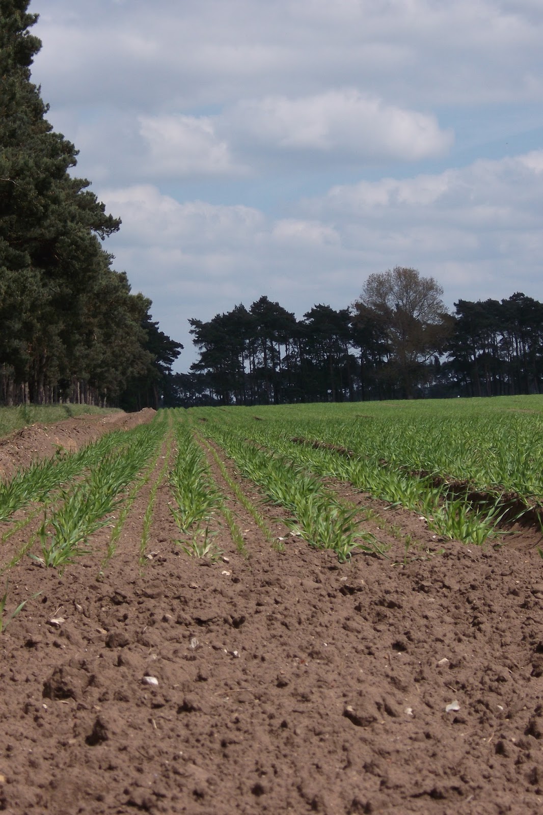
Would I have been drawn to this field before man had imposed his control? It was the shapes created by the lines of pine trees and the light between the shapes that first attracted me to stop. Then I learned that those trees were the key to open mans ability to control this land by reducing the impact of the wind on the soil.
P24/5
In Crawfords 'Comparing natural Beauty and Artistic Beauty .. he goes on to consider criticisms of the meaningfulness of comparisons between artistic and natural beauty. ..works of art are intentional .. requiring meanings and interpretation and criticism.. the aesthetic appreciation of nature .. is restricted to an appreciation of its sensuous surface. In nature no intention constructs these objects therefore they are qualitatively distinct from their artistic counterparts. two responses to this claim are possible : to argue that natural beauty possesses the expressive and semantic properties that art does or to understand art and nature on a continuum based on some general principle that makes comparisons meaningful.
An alternative mode of comparison may emphasize that interdependence of fine art and natural beauty. Some works relate to nature in that they depict it. Others directly make use of the natural environment in their artistic realization and are .... about their relationship with it.
This is where I can relate to Crawfords essay and feel that it has helped me consider my work a relationship and not a depiction. This has released me from strving to order and relate the parts of the design to reality but to see their relationship to each other as a pleasing sensuous experience.

So this is where I am at the moment.
Trying to combine and layer dyes to give the feel of winter.
Design the shapes of that field in winter that interprets rather than depicts.

This design is still too much of a depiction!


Experimenting with resist using clamps, wood and pegs but may try using the wax to have a more exact definition                                                                                                              

Sometimes the stain from the wood gives a useful colour but cannot be planned.

Thursday, 19 May 2016

POTS AND DESIGNS

The eucalyptus is simmering away on the range in two different pots. I saw and bought 2 beautiful copper pans at a Fair but am not sure if the metal content of the pans will effect a change in the dye colour outcome. So decided to do a comparison by following the same method for both. I also bought some iron fillings and need to see if the will sadden the dye colour to create a grey. So half of the eucalyptus samples will be modified with iron water

 Aren't they beautiful?!! The first difference is that the copper pan takes longer to heat up but retains the heat longer!


I have been concentrating on the tracks left by tractors and by man on the field looking especially at the images on the day it snowed and layering my marks and designs with other aspects of the field. The stubble makes interesting lines and shapes even when you turn it around.


Tracing paper allows layers to be
built up and composition adjusted.
The layers of dye include nettle, indigo and blackberry which will not be colour fast but I want the bright colour from the berries to lift the other colours. The trial scarf, same fibres smaller size; gave me an idea of the order but the dyes need to be more definite without patches also the grey disappointing. But I think the combination reflects the snowy day. So more trials! I will do the wax first because the colour of the blackberry will be changed if it is immersed.
Now I must get the wax resist design from the tracing paper developed, first on wool delaine keeping to the dimensions of the final hanging.


Professional Practice

It is interesting that after what, 4 years of studying textiles and being product focussed it is in the last few months that I feel a real path beyond NUA. The Professional Symposium in the Ideas Factory also added to my new thinking.


I really can see the potential of having a studio post Masters in the Factory as it was explained, there are various advantages within the package. Incubation is a lovely term - makes me think of fluffy chicks! - for starting a new business idea with all the professional support/advice, the creative environment and the excellent facilities available in the centre. As I am thinking a service/ knowledge base/ workshop/ talk based business with a practical practice in natural dyes, the Ideas Factory may be just what I need! A really useful session and Sarah was very approachable. Funding session also helpful.
The Ph session has convinced me that isn't for me. Although I do love the research and feel there is so much more to learn and to discover with natural dyes the PhD is not the answer. But lovely talking to James and hearing about his work.

The afternoon sessions I went to were good for talking to others and sharing ideas. Sebastian had asked us to bring our CV's (it took me an hour to find update and load up!) but they weren't looked at - he went through a sheet about formulating CV's and thinking about their function. Useful but we can read through the sheet and more case studies and general discussion could have been really useful. However he has seen mine and sent me his observations. This is my next task to get one off to Head of Operations at St Edmundsbury Borough Council. So good timing!


Post MA and the Public Speaking workshops were more informal and more networking than structured. The post Masters time is something which many students find difficult and another reason why the Incubation centre is a good link out!!
 

Wednesday, 11 May 2016

DIARY

This is a quick post but can't believe I haven't been blogging for a week.
The tutorials/discussions/presentations have been so useful and resulted in lots of activity!
I have sent the Dean of St Edmundsbury cathedral a profile and images of the 'Unexpected Blessings' hanging hoping that I can interest them in using it within the cathedral and have contacted the Heritage Department with the view to discussing collaborative events. This is all in the direction that I feel is right for me ie communicating my research and interest in sustainable textiles from an historical as well as practice angle.

My final pieces are beginning to take shape and by creating a diary I feel that I have a clear record of methods and processes which can be replicated -


DIARY OF FINAL PIECES FOR MASTERS


DATE
DYES
GREY COLOUR FROM :
·         Nettle + indigo
·         Walnut + iron
·         Rhubarb +
BLUE FROM                           indigo
PINK COLOUR FROM           crushed blackberry
RESIST USING               adhesive or soya wax from Art van Go
9/5
SAMPLES to test resist possibilities
Blackberry dye bath used to test Soya Wax and adhesive. Temperature to melt wax etc.
100*c.
Washed in hand hot water. Dye washed out!
TEST 1 Was also heat pressed after adhesive added.
TEST 2 Adhesive and soya wax only
(Soya melts 110 – 140*c) Saucepan heated with boiling water from kettle to 125*c. Samples left in to let resists melt til water cold.
B’berry colour washed out – silly me!
Indigo next samples!

SAMPLE SQUARES WOOL DELAINE
1.       Walnut shells dye bath heated sample added left on heat 10 mins then in dye bath til cool. Immersed in iron bath. Redyed using hot method then iron. Indigo but no real change in colour
2.       New Nettle tops dye bath scalded with boiling water ten heated to boiling. Strained and sample added to cooling bath. Indigo for 5mins
3.       Rhubarb mordant brought to simmer covered. Left overnight. Indigo for 5 mins

SCARF COTTON
Dyed in B’berry (juices) dye bath. Not washed so colour remains unchanged.

SCARF WOOL/SILK as per final piece
ORDER OF METHOD
Soya resist line
Crushed berries
Grey dye
Design
Indigo
1.       Cellotape and soya wax resist lines on scarf. B’berry crushed spread between lines left 15 mins then berries removed and scarf left to dry.
2.       1/3 left in warm Nettle dye bath overnight
11/16
SCARF WOOL/SILK ditto
Indigo
1.       Dye bath adjusted to 10 Ph
2.       End 1/3 dipped into indigo 5 mins ie 1/3 over nettle and 1/3 indigo only
OUTCOME: indigo seaped into berry colour.
                    : Nettle/indigo green not grey.
                    : indigo a bit patchy so will re dip.
1.       Rinsed in soapy water. Re dipped for 10 mins


                           AND ITS TIME TO START HARVESTING FRESH MATERIAL!!!


Sunday, 1 May 2016

Review

After a tutorial which was to prepare us for the final section of our Masters degree I decided to go back and read the units that led to my current position and then evaluate where the final submission will be critically. So here is a resume of my journey of thinking!

It started with the Rana Plaza fire and an image of a river which had been polluted by the textile industry in China!


B7 RESEARCH REPORT 2014
When I watched the Panorama programme Dying for a Bargain and saw the images of clothing labels after the Rana Plaza fire (BBC Panarama, 2013) it made me reflect on my role as a textile designer who is trying to work both ethically and sustainably. I was also aware of my commitment as a Quaker to sustainability and ‘a concern for the Earth and the well-being of all who dwell in it’ (Religious Society of Friends 2011) I decided to find out how the fashion industry helps those who are committed to ethical practice and sustainability and to support that commitment. The Panorama programme uncovered hidden facts which were only revealed when clothes labels from well-known brands were found amongst the rubble.

RIPU 2015

The people who made clothes of plant fibres 2,800 years ago didn’t limit themselves to using agricultural plants. Researchers think they were conscious users of wild plants too. Until recently it was assumed that the piece of cloth from Lusehøj was linen, made of cultivated flax.
New studies using polarised light microscope techniques and isotope analyses show the fabric to be woven from nettle fibres, probably stemming from Austria.
This means that wild plants, not just local but imported ones too, probably played a bigger part in clothes production than previously thought.
When the first chemical dye was discovered by William Perkin in 1856 the skills and traditions of the natural dyer were threatened as well as the environment. My report looked into historical evidence and considered the importance of natural dyes as a factor in environmental and socio-economic development for today’s practitioner. Advances in technology and science applied to archaeological evidencing have had an impact on the ability to identify the fibre as well as the dye source from finds.  Geographical, historical and literary references to natural dyeing in Morocco compared with East Anglia indicate the relevance of dyeing in everyday life and identity across continents. The Report informed the direction and developed a deeper understanding of natural dyes within my practice.

ASU2 2015

Cultural imagery is the imagery that people within a culture have and use to interpret events. It is imagery that reinforces the narrative and beliefs of that culture.Researching techniques and tribal textiles.
HISTORY OF TOOLS
An important aspect of textile production is specialised know-how , which was needed from the Bronze Age and significantly from the Iron Age onwards, when particular methods of patterns and weave types appear. Also, trade was necessary to obtain imported dyestuffs.For Bronze and Iron Age textile production, a great deal of information about tools from archaeological excavations is available.
In Indonesia the main tools used for resist is the tjanting and the tjap. The metal cup holds the molten wax until tilted to draw the design.  For Iranan Chinese a ladao is used which is also made from copper to hold the molton wax but has folds of metal instead of a cup with a spout.

So I made my own tools!

RESIST TECHNIQUES
SHIBORI -There are an infinite number of ways one can bind, stitch, fold, twist, or compress cloth for shibori, and each way results in very different patterns. Each method is used to achieve a certain result, but each method is also used to work in harmony with the type of cloth used. Therefore, the technique used in shibori depends not only on the desired pattern, but the characteristics of the cloth being dyed. Also, different techniques can be used in conjunction with one another to achieve even more elaborate results.

So I went on a workshop and experimented with resist techniques

SNU
This was the unit that really advanced my knowledge and understanding of natural dyes. It also made me realise that if I wanted to interpret a design, like textile practitioners who use chemical dyes and fine artists I needed a colour palette that I could replicate. Therefore by centring on one plant I could understand how to effect change AND to consider sustainability in energy use and collection of raw material. So I chose nettles!!!

The colour range was significant and season, plant part a well as temperature were factors. So this knowledge can be transferred to other plants and dye sources. ALSO I am beginning to realise that 'natural' doesn't mean chemical free!!!!!

It was vital that my records were explicit and could be replicated as any research has to be reputable if it is to be shared with other professionals. I visited Head of Biology at UEA to explore further research.

There were also interesting links with the previous unit as nettles have been used as a fibre and as a dye.


ASU1
'The context of this unit will be based on the scarf. I will be experimenting with design, form, colour, image and materials.'
So now moving away from samples I started to consider context and experimented with techniques form and technique.


MASTERS
The Field became the focus of my attention and I found out more about the history of the area things like the rows of pine trees which are signs of mans ability to control nature. The visual signs from the field made me become interested in the changes caused by nature eg snow


and man eg ploughing which made the field a subject for interpretation.

The Bishops Prize gave me the opportunity to try to convey a message through my work and develop my practice and the possibilities for the product. Although I used a recycled shawl I used layers of dye to interpret the layers of history that I had researched to interpret ' Hidden Blessings' focussing on the line .. and the meek shall inherit the earth. This experience especially when I was stewarding revealed the importance of 'the message' in my practice.


SEMIOTICS
Beyond the most basic definition, there is considerable variation amongst leading semioticians as to what semiotics involves. It is not only concerned with (intentional) communication but also with our ascription of significance to anything in the world. Semiotics has changed over time, since semioticians have sought to remedy weaknesses in early semiotic approaches. Even with the most basic semiotic terms there are multiple definitions. Consequently, anyone attempting semiotic analysis would be wise to make clear which definitions are being applied and, if a particular semiotician's approach is being adopted, what its source is.
Living in a world of increasingly visual signs, we need to learn that even the most 'realistic' signs are not what they appear to be. By making more explicit the codes by which signs are interpreted we may perform the valuable semiotic function of 'denaturalizing' signs. In defining realities signs serve ideological functions. Deconstructing and contesting the realities of signs can reveal whose realities are privileged and whose are suppressed. The study of signs is the study of the construction and maintenance of reality. To decline such a study is to leave to others the control of the world of meanings which we inhabit.

Also as a live guide at the British Art Show I have been asked to research Adam Broomberg and Oliver Chanarin and interestingly their piece of work 'Dodo' is about the destruction of an untouched pristine piece of coastline in Mexico in the making of the film Catch-22. And related to the extinction of the Dodo purely because of the actions of man. My field has been touched by man and the signs are interesting to research and to record.


This Review has enabled me to clarify my practice which is not product based but is message based but may need to use the product to convey the message. Therefore the product will need to attract an audience and once captured it is important that the audience is held so that the message can be conveyed. This may be through labelling (which is where I started with my report into the importance of information held in the label!) or another form of publication. Or through workshops, displays and exhibitions.
Implications :
          quality design and use of natural dyes
          labelling and booklet that tell the story.