Thursday, 10 March 2016

reflection

There are times when moving forward is difficult!

Lack of motivation, panic, self worth, outcomes, feedback and the future are all impacting on my ability to progress. Also outside factors have meant that my time has been limited to half days and I know that I achieve more when I can allocate at least 2 day periods of time to my project. I really admire the students who complete a Masters and keep working. However it may be that the limited time makes them more focussed and achieve more in a limited time??!!
So what HAVE I been doing? Coping with technology! After updating to Windows 10 I have discovered that it isn't compatible to the University system, to my version of Photoshop and has led to a complete shut down of the system because it hasn't recognised the password. My computer guru has sorted the problems but it has just added to my negative state!
Doesn't the weather affect your outlook!
Today the sun is shining after a day when the rainwater levels were so bad I had to get bags to fill with sand and keep the water out of the wood store!

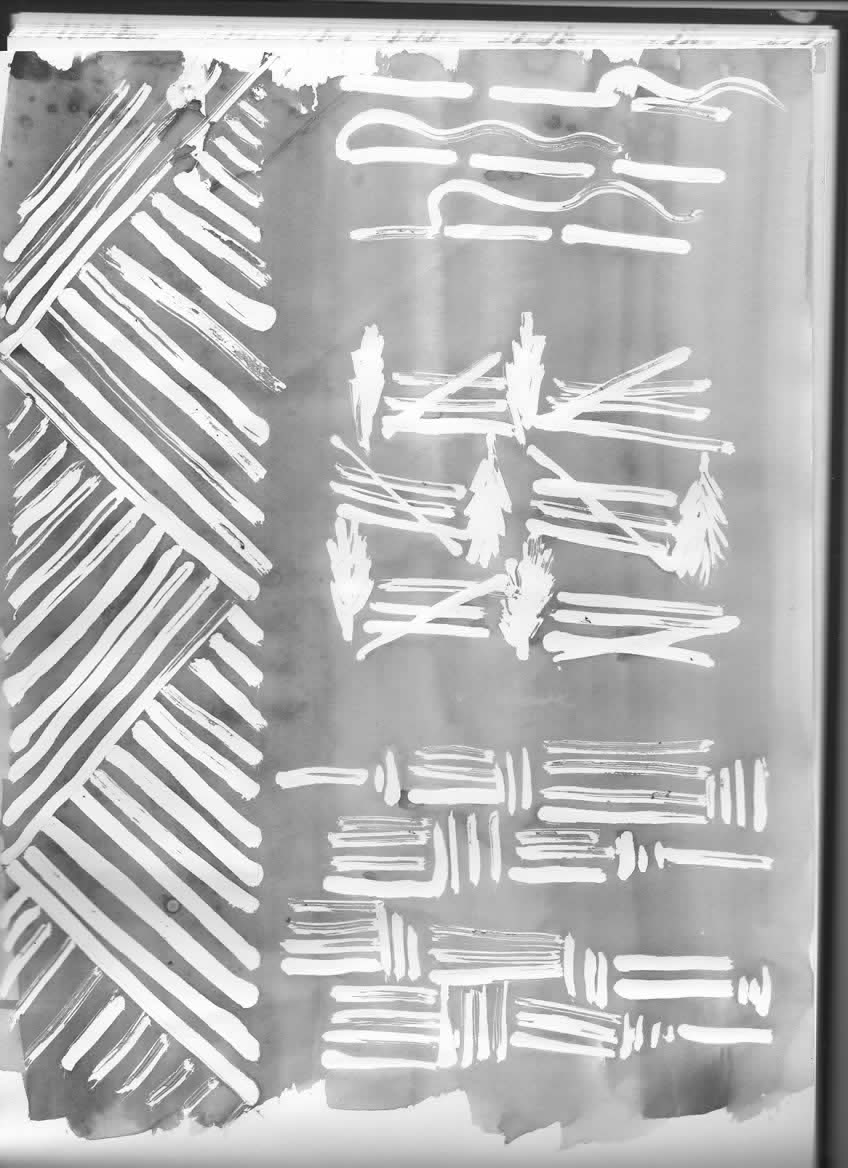
 Positives??? Well I have continued to use inks and masking fluid to explore the images of the field in the snow.
The furrows of the field were partly covered so the masking fluid was ideal to interpret the 'patchy' snow.
But I think these lines could be stylised further and so I revisited the images of the tribal textiles I had seen in the British museum.
 The patterns of the tractor tyres between the furrows added interest so I explored the pattern of the treads as well as combining them with the converging lines into the horizon.


                                                                  I  will scan these drawings/images into Photoshop then explore wax to develop a design which combines some of these patterns. It will be good to return to the designing process that I used during undergrad work. Indigo and blackberry dyes will give me a palette for snow so I need to make up my indigo dye baths. I want to extend my research into colour ranges from one plant source to woad and restrict the use of chemicals.                                                                                                           


 The remains of last years crop as stubble is emphasised by the covering of snow but I haven't been able to work out how to make the negative image. By concentrating on the structure of the individual stalks and the remains of the layers around the stalk has made them look almost bamboo like and Japanese.

So now I need to allocate a 3 day period of time to really get back on top of my work and try to generate some motivation!!


Tuesday, 1 March 2016

Ploughed Field - the Bishops Prize

So it is finished after dipping, dyeing, over dyeing, rust printing, foil printing and hand painting. This may seem a lot of processes but when you consider that I had intended quilting  and hand stitching as well in Nick's words 'the sweetie shop has been reduced'!!
So here are some images of the process -


The first dye was in Red onion which I dipped into a hot dye bath. The wool had been wetted to allow the dye to filter up and create an uneven line which I wanted to use as layering of the fields and to use to reflect the changes over time.
 You can see the line on this image. Here I am dipping the bottom part into a hot walnut dye bath to make a darker contrast for the foreground.

Now the rusted blades from my father (and grand father) workshop. Their shape gives the impression of the furrows ploughed in the field. But ....
when printed over the Red onion dye the iron partly oxidised! In the workshop I used the footprint screen that I had designed and used gold foil onto a paste to represent the footprints of 'the meek who will inherit the Earth'. Originally I was going to add stitch but  

 was pleased that the footprints over the 'furrows' were enough.  The top of the piece was dipped into Indigo several times but I did not achieve a contrast however it seems to work as a paler blue.
I added hand painted trees using oak and walnut paste
to represent the pine trees which were planted to stop the wind blowing the sandy soil and enabling man to cultivate the land. 


It has been a challenging project and I have learnt a lot not only about composition with natural dyes but also about the history of this piece of land.


Eucalyptus Dye

I have been using the Eucalyptus tree as a dye source since my early days of using natural dyes but never achieved the orange tones in Jenny Dean's Wild Colour or India Flint's eco-printed orange leaves. So I'm going to follow India Flint's method to the tee having read her book, made notes and gathered fresh leaves, dried leaves and bark so here goes.

The fresh leaves from Stowmarket were soaked overnight in rainwater, the SS container heated until it was just below simmer for 45 mins. I made sure that the water did not heat above 'steaming' then sieved out the leaves.
Eucalyptus is a substantive dye source ie does not need a mordant and I am beginning to focus on this as an asset. The research into nettles has made me realise that I can achieve a range of colour tones by using parts of the plant, seasons and use of a hot and a cold dye bath. The dye baths made so far are from 2tree sources and 2 parts of the tree ie leaves and bark.
I am using silk scarves for my trials as well as wool delaine to record the narrative of the dye bath. The wool samples are a very different colour range and the results make me reflect on their application. Anyway there were 3 outcomes from my dyeing session because I also used the bark from the West Stow tree which had been soaking for several weeks. But I made sure that India Flint's method was followed closely.
There were 3 shades of a creamy orange which were quite pleasing but still not a distinct orange, I may post a comment on the Wild Dyery site to see if anyone can suggest how to achieve an orange.
Unfortunately the images do not do justice to the colours but when I researched blackberries the colours were very pleasing ........
From left to right : Frozen berries with no heat
                               Fresh berries hot
                               Fresh berries no heat
                               Cuttings of leaves and stem soaked for a week hot dye bath
These colours have related to some shots of the ploughed field after a fall of snow and I want to work an developing images/designs from these photos and use the blackberry colours. I think the snow images would also work with wool and indigo.


Sunday, 14 February 2016

Screen Printing with Oak and Walnut paste

Translating my sketches and ideas onto Kodatrace to screen print with natural dye paste has been interesting. It has been a long time since I have done any screen printing and so the first samples and scarves have been a learning curve. It's things like considering size. The dimensions of the scarf are going to have an important affect on the effect of the print and the repeat and I need to go back to Photoshop to plan the layout. The lines representing furrows gave perspective and I had invested in 3 Posca pens from the uni shop so had options to vary thickness etc.


But the thick lines were very heavy and too
dominant. Also need refinement and better
use when combined with the tree and animal shapes. I liked the tracks with the strong tractor tracks and lighter footprints, they were more adaptable. On the third scarf ie the one to the left, I tried masking the images so that I could use them in bands with the track marks, this related more with the tribal work I had seen at the British Museum and more successful I think!


The paste was used by boiling 10 gm oak chips in 1/2 litre of water too extract the dye then sprinkling Indalca on top and stirring vigorously to thicken. This sometimes needs to be whisked and sieved. I also used 20gm walnut husks to make the brown dye paste.
I decided to darken the oak paste by adding a little indigo and this resulted in a black print.


I used the scarves from the previous unit which had been dyed with red onion and walnut. I also had one scarf with a yellow from the leaves of the Tree of Heaven in my garden. This scarf shows how important size and planning is - the images overlap awkwardly, they don't fit the space and you can also see the difference when I added indigo to the oak paste. It will be interesting to see if steaming affects colour density.


Friday, 5 February 2016

The Ploughed Field 2

I wanted to discover more secrets from the field and parked in the gateway. There was a group of off road motorbikes in the forest behind and their noise disturbed the usual quietness of the field. I walked along the headland a little way and looked more closely at the stubble left from last years crop. The stalks are grouped in 'families' but where the tracks of machinery have trodden the stalks down the 'families' are no longer heading in the same direction. The colours are more interesting than first imagined and stitch/wax resist come to mind. I need to sketch them to fully understand the organisation of this community of stalks!

 There leaves trapped by the stalks which would be slowly breaking down and without the intervention of the plough would fertilise the soil. But they also contrasted the straight linear shapes of the stubble. The colour combination was also interesting - pale yellow white and even purples with the russet tones of beech leaves.

I also found ears of corn which I will look at in the next blog


But there were the tracks and furrowed lines of the field which I still have lots more to explore in pencil paint and print. Such a wealth of ideas from this ploughed field!


After my tutorial the world of semiotics and indexical signs beckons. Looks like I have lots of work ahead - so exciting!!!

SDC World of Colour

The London College of Fashion behind Oxford Circus is so not inspiring as a building but the speakers at this event all had something which was inspiring It started with an 'old' faithful Bill Stephenson and his delivery of Colour Perception. But I was fascinated by the research into Colour Psychology by Angela Wright -
she  explained exactly what colour is and how it works, discussing traditional ideas about its influence on behaviour and mood before going on to describe the discoveries she has made over the last twenty years. she showed how you how apply the theory of colour to yourself and your wardrobe, whatever your gender, race or colouring, and expanded on applications in your home, your workplace and in commercial design. Personality types and their relationship with specific colours and tones. She spoke about the quizzes and practical examples to work out a 'personal palette' and identify which colours are most supportive for you.

Anyone considering the context of a practice would find her work helpful and made me reflect on the colours I extract from natural dyes and where they fit into the colour palette. The 4 groups have colour types which I can achieve but it will be interesting to consider the combinations and background colour.

The next speaker was Raffa Mula from Pantonelive talking about the measurement of colour. It was more useful for designers who were having their designs printed but still an interesting aspect  of colour.

But I also had the opportunity to network and was discussing my research into plant colour and the chemistry of molecular change. As a result I have contacts at Leeds University and a SDC member of staff Debbie Bamford.
But I think this aspect of my work will be in the background for a while


The British Museum and another inspiration

The British Museum always seems to deliver! So many times I have visited the Museum because it was near the reason for the visit. Last time I was enchanted by the Barkcloth from Tonga which influenced my mark making and the way I interpreted my drawings. The Masters unit had taken me into a different direction but this visit fitted so well with the direction I have been going it was just amazing how yet again I feel that there must be some connectivity out there!

BARKCLOTH DISPLAY 
 This week it was the SDC World of Colour event and with a morning to spare a visit to BM seemed a good idea! One of the exhibitions was a large piece of woven silk from Assam :

The textile is associated with the cult of the Hindu god Krishna. It is today made up of 12 strips of woven silk, each one being figured with depictions of the incarnations of Vishnu and with captioned scenes from the life of Krishna.

Once again I was attracted to the imagery and interpretation of the environment and spent sometime sketching the details which always helps me to understand the repeat and the orientation of one image to another. I was also reflecting on the drawings etc I have been making from the ploughed field

DETAIL OF ONE OF THE STRIPS


But it is the raison d'etre that really made me reflect on my work. The Vrindavini Vastra is the story of Krishna's travels and has a narrative.
The Ploughed field is also developing into a narrative and with the personal additions of rusted parts used by my grandfather it is an exciting prospect


                           THE VRINDAVINI VASTRA