Wednesday 29 April 2015

Deep fat fryers and water heaters

A day returning to the dye vats and trying out the deepfat fryer for wax!
I had been to see Jean Beale and bought some madder roots; some of which I planted, and weld tops for new dye vats. I soaked the roots overnight then put them on the range to simmer for half an hour, the liquid was drained out and made up the volumne of rainwater to 10 litre approx. The weld had boiling (tap) water poured over, left 5 minutes then strained, more rainwater added to approx 10 litres and the wetted fabrics added and were kept under the surface with a plastic lid. The samples were all cottons so I tried leaving one for 3 hours, one overnight and one for 48 hours. There was little difference in the outcomes but the colour was really vivid. I will use one of the samples in woad after re waxing to try to achieve a yellow, green and blue blend.
I want to begin to develop the design and colours and starting with this grid will form the basis for a repeat pattern. Some of the african wax resist designs use creatures from their environment so I'm thinking fish!! Need to visit a fishmongers to look at the different shapes I'm particularly fascinated by the heads.
The madder proved more variable according to the time in the vat and the mordant. The samples here are not a good representation of the actual colours which are salmon - left in overnight with alum mordant and a blue pink taken out after 3 hours but a copper mordant. There is a third sample which was left for 48 hours and is a deeper salmon. I decided not to simmer the vat which would have resulted in a deeper shade.
I'm pleased with both a these vats which can be used at least once or twice more.
The day was also spent exploring the new copper tools I have made and using them to interpret the studies I have made of water, beaches and fish. I used Sarah's designs so there are areas along a central line. The fat fryer was a great success and heats up very quickly so saves elec!
I am also using fabrics cut to the dimensions of a book dust cover so that I can put some samples together for a local art supplies shop who may be interested.
The copper piping tools made a texture which I feel can be seen to represent fish scales but the 'ladau' is more difficult to control. I think that the copper pipes could be developed by altering the shape of the pipe and ensuring that the ends are completely level. The 'ladau' needs a thinner copper.
Really pleased that I could get dye vats made, begin to think about interpreting my sketches/designs with wax and complete 6 designs then begin boiling out the wax in 2 days.
The next challenge will be to reactivate the woad vat and make up one with the woad balls. Considering buying a water heater but not sure if I will have the £89 that a new 15 litre model costs. Might have to leave the woad balls for next month!!

Saturday 25 April 2015

Woad Inc

After several weeks of research, meeting interesting people and sketching from artists work it is time for developing designs and interpreting them in dye and resist. So the timing of the Woad workshop was ideal as it allowed me to revise the indigo process and ask Ian about problems I have had with vats and investigate methods using woad balls.
Ian introduced the history of woad to the group and how he and Bernadette, his wife have used woad to work with the fashion industry as well as supplying Jarrolds with indigo scarves etc and supplying a range of products from the woad including oils, inks and dye kits. It was a compliment that he referred to my work and I was able to contribute to the session.
The woad in my garden is on the verge of flowering so I wanted to be sure of how to harvest the seeds and sow last years seeds for an August crop - here's hoping for a warm summer!.

Last year I was able to pick enough leaves to make a weak dye bath but will use Ian's woad balls this time as this was the method used historically -  the balls were an important trading commodity for England as well as many other countries. Back to the workshop -
The hands on session involved choosing a resist method where string, plastic tubing, clamps and sewing are used to prevent the indigo dye from reaching areas of the silk. The group produced a range of outcomes and it was useful to see how unpredictable (but attractive!) the designs developed. I was interested in the wooden shapes which could be clamped in place and result in a very definate outline.
 Thinking - fish shapes could be combined with wax resist?

 During the dyeing process I was able to see and ask Ian about the logistics of dyeing larger pieces. he has accumulated a number of Burco boilers but also adapted a bath by inserting a thermostat and heating elements. Think I will be going down the Burco route!
The layout of the dyeing room included hanging wires and sinks for rinsing, a washing machine which he uses for mordanting and a spin dryer.
Mordanting in a washing machine will be much easier for me than using the bath which often leads to patchy areas of mordant.
My day with Ian has been a real help, I bought the woad balls etc so that I can get started on a new dye bath. I intend to reactivate the one I used last month by adding Sodium Hydrosulphite which dispels the oxygen and compare the outcomes of the 2 dye baths.
On Ian's recommendation I have looked at Jenny Dean's Blog from 2008 where she describes her use of the woad balls that were sent to her by Ian.
I have also bought a deep fat fryer as recommended by Helen Dougall so that I can have a wax pot which has an opening large enough to take the copper tools I have made.
So here goes no more mark making interpreting my designs ........

Friday 17 April 2015

Bio hacking and textiles

'Raphael Kim is a biohacker-designer and a former student from Design Interactions at the Royal College of Art.'
A workshop with a bio- hacker and his introduction about extracting DNA didn't grab my attention but by the end of the workshop I was excited by the potential of this new direction where science and textiles converge. I found phrases like 'controlling nature' and 'manipulating DNA' worrying. I am passionate about sustainability and protecting our environment so someone talking about controlling our environment made me very concerned. I held my tongue but ethical practice and the opportunities for subversive acts worried me. However when he began to give examples of the ways the language and lessons of nature are being used creatively I began to see opportunities - bridges from bending branches, bacteria in cement cellulose sheets - where human intervention has resulted in interesting and aesthetic outcomes.
The work of Suzanne Lee where she uses bioculture to grow cellulose and make jackets and other clothing where no chemicals are involved is worth investigating.

Other names Raphael mentioned were - Sonya Balman, Michael Burton and Phillip Ross. He also mentioned Thomas Landrain who grows his own ink but I couldn't see how this was more beneficial than the woad and walnut inks I use.
But it is a different way of thinking and when we were shown how to extract DNA from strawberries and told how much of the equipment needed for bio hacking is available on Amazon and the lower cost implications - could this be the future?
I had been thinking about the current political interest in learning from natural dyes to make chemical dyes less toxic and how advances in science have resulted in gaining knowledge about ancient textiles. I spoke to Raphael about my idea to compare the colour from the same plant, probably nettles, grown in different mediums, atmospheres, climates etc. He has given me a name of a Professor at Imperial College working on the connection between plants and soil. It is an area of research in which I am interested but is it unconnected to my current research and practice?

Tuesday 14 April 2015

Association of Art historians Conference

The Conference was well worth volunteering for and being an assistant meant that I spent the Saturday in a forum entitled Shades of Grey convened by Janet Allen a curator from Ireland and Annette Wickham an undergraduate from UEA.

 Stillness, solitude, mysticism, equilibrium, urbanity, ennui, emptiness, anonymity, urbanisation, industrialisation, smog, fog, shadows, dust, dusk, nocturnes, concrete, steel and stone are some of the many connotations that artists and art historians have long associated with grey paintings.

Over a period of roughly 100 years, marked by the invention of synthetic dyes in the 1850s to the advent of colour television in the 1960s, Western material culture (high and low) became increasingly saturated with colour. Corresponding with this era, which saw architecture go polychrome and art go Pop, a number of modern artists eschewed colour, opting instead to pare down their palettes and make pictures executed largely in shades of grey. Some, like Whistler and Giacometti, painted in grey for significant parts of their careers while others, like Van Gogh and Picasso, did so for brief but concentrated spells.

This session presents papers exploring grey pictures, the motivations behind their making and critical responses to them. Papers relate to individual artists and specific artworks, as well as to wider ideas associated with greyness. As a ‘non-colour’, how has grey been used to mute narratives and meanings and to signify modernity and silence? How are grey pictures connected with sculpture, printmaking, archaeology, architecture and photography? Further areas of interest include – weather and temps gris, colour theory, grisaille, underpainting, ideas relating to surface, finish and completion, symbolism and social issues.
These are my notes:

Iris Wein from Berlin a colourist.
Use of colour to convey political and emotional responses - Summerland - J. Constable.
Old Sarum - J. Constable the sky conveys a protest against the political situation.
Use of twilight to minimise detail as in The Mill - van Rijn
'The blue of the sky is a subjective experience' Chromotography - George Field 1835. Tiny particles refract light.
Rumfords experiments with light - complimentary colours in 'light'. Red light generates green shadow, blue light an orange shadow.
Elements of light - John Howard.

Anthea Callen Gris clair and coloured greys.
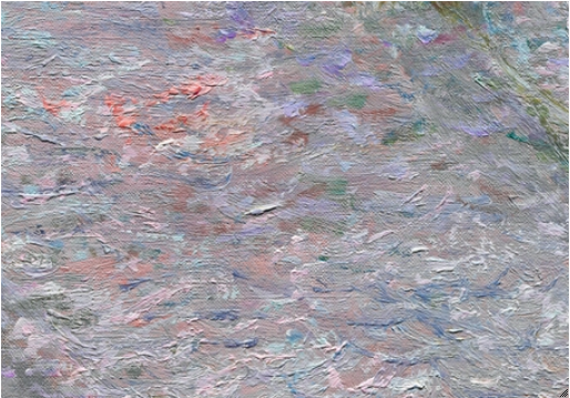
Sunshine associated with blue sky ; diffused light is local saturated colour. In 19 century painters palette had no seperate grey. Paines grey is a mixed tint - indigo, raw sienna and crimson mixed.
3 whites - Titanium/Lead/Zinc. Their components gave inconsistency.
Pissaro - Colours in Landscape
Pigments - earth colours ie from minerals etc in the earth and tints. See Monet's 'Bathers' where he uses greys for the water and earth colours for the bathers.
IDEAS - look at the idea of grey in paintings to convey emotion. Would it work with dyed textiles? Try using indigo as a form of greyness.
 Dr Lelia Parker from the National Gallery - Dutch fine art in black and grey.
Analysis of Dutch painting by Bailley of a girl at a window. A mezzotint. He later used photography and painted from the photographs. 
Details of boy, telescope and their significance in this painting.

Frances Guerin - University of Kent - The Politics and Polemics in Luc Tuymans paintings.
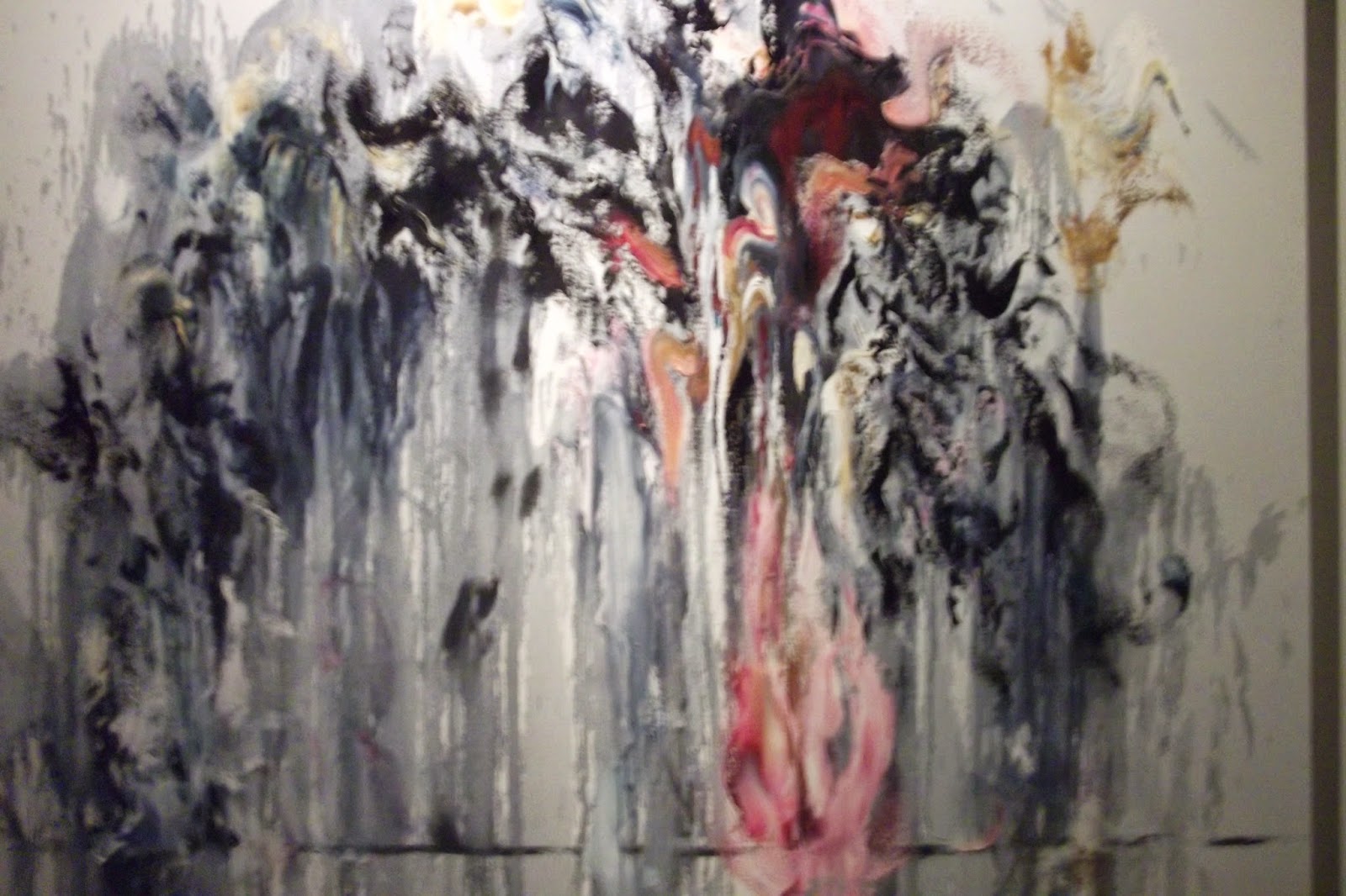
Tuyman uses grey to create enigma for interpretation - politics and culture. His work deals with the trauma's of 20th century. Creates disquiet. Painting from something else is not original. 
'Grey is the colour of abstraction'. 
In 'Church' there is no pomp and ceremony of the religious building it is treated austerly in greys. 'Demolition' converts drawn images into painted images his subjects are outside the frame eg The Park ; a site of a murder, Zoo a window about captivity which he expresses in his narrative. The story behind the painting.
FRANK by TUYMAN
Dr Anna-Maria von Bondsdorff Curator from Finland. Picturing the Immaterial with Colour
Colour and meaning in Nordic painting. Symbolism in a white landsacpe. 
Pierre Puvio de Chavannes
colour used had a significance a deeper meaning. 
Anti colourists Helene Schjerfbeck - Churchgoers'
Modern times needed a new language. 
Colour ascetism - tonalism. The palette : black,brown, white and earth colours.
Seuret v Kandinsky.
Kind of colour used - Colour Ascetism - monochromatic eg Toini
                                                               - contrasts eg Angelina
Use of watercolour and charcoal
 
Taisuke Edamura Essex Post graduate now living in Japan - Gerhard Richters Grey Glass
glass a colour that does not belong to black or white.
Grey - its ambivilence
Glass - an in between.
Townscape - he abandended what was originally on the glass and painted over with grey.
Grey surrounds us and we ignore it - grey has the capacity to make the invisible visible.
THOUGHTS during the lectures - experiment with timing fabric is in the dye. How much can the tones be controlled? Consider silk! 
Nettle idea to see how much earth type affects outcomes. Brooches!!
Brushstrokes.


Mordanting

Natural dyeing just isn't something you can do in a day. Well it is but before that day there is preparation and it has taken me the best part of a week to mordant and prepare the fabrics to accept the dye.
I bought cotton twill, calico, fine cotton and wool delaine from Whaley's via the university. I have tried to find other direct sources and would really like to keep to organic cotton but am still thinking about the different properties of the fabrics and the fine cotton is much lighter than the twill but both have attributed when it comes to resist. 
So the week started with the cottons which need to be scoured before dyeing.
Cotton and Linen dyeing requires a different approach to wool and silk. The metallic part of the mordant does not attach readily to cellulose until it has reacted with Tannic Acid (tannin). This means dissolving the Tannin, filling the bath!! adding the dissolved Tannin then immersing the 550gms of fabric and soaking for 24 hours!
I want to try some of my design ideas -
creating a sea of colours after seeing Monet's Bathers


                            using the indigo dye at different immersion timing to create waves of colour after Maggie Hambling's work
 
So after the Tannin I looked through my dye samples and chose to use Alum and Copper mordants to achieve the colours I need.
The Alum is dissolved and added to a stainless steel pot then Soda added - the water is heated to simmering with the fabric immersed and about 5 litres of water was needed to keep the fabric under the water. I stirred occasionally to keep the fabric fully soaked and simmered for an hour then left to cool for 24 hours. All cotton fabrics and the wool delaine were mordanted which came to 500 gms.
I also mordanted 500gms of fabric with Copper but this was done the next day as I only have one container that holds 5 litres of water plus fabrics.
All the fabrics were rinsed in the washing machine then LABELLED!!
So 5 days later I need to get the paste made and buy a deep fat fryer to melt wax. The deep fat fryer idea is from my visit to Helen Dougall's studio!

Tuesday 7 April 2015

Monet Seurat Balke and Maggie Hambling

It is so easy to stay in Anglia and forget about the inspiration that can be found in London. I chose to drive and parked near Kings Cross - which has cost me a Congestion Charge! But the drive was interesting and walking from the car park through the streets of Bloomsbury and past the University of London had an exciting feel, the students the people the shops and restaurants. Then onto the tube to the National gallery. The Monet rooms were closed but there were lots of wonderful paintings and I spent a long time studying and sketching with special focus on the way these great artists portrayed water.


The use of the brush was significant and the range of colours to capture the water. I thought about using the brush in the same way with wax and with multiple dipping into the dye vat building up a blend of marks which become a whole. I do like reflections in water and later photographed the reflections in the water at Paddington Wharf. Some of my recording can be seen at the end of the previous Post.
There was a special exhibition of Peter Balke's work. His turbulent painting of the North Sea were in contrast to the Impressionists work and the use of brush strokes to create movement is something I can try with wax.
I found Maggie Hambling's latest exhibition at Kings College on the embankment - War and Requiem which included some of her 'water' work. Her energy comes across strongly, these giant waves with the use of an orange or a red area to add interest and contrast. I particularly like her sketchbook which used black paper and white paint to quickly catch the movement of the water and waves. Looking forward to trying this in my sketches.


SDC and London

I have been selected to be on the London region committee for the Society of Colourists and Dyers! The AGM meant a trip to London and the opportunity to visit some exhibitions.
The venue for the AGM was M&S headquarters in Paddington. The area has been developed with magnificent architecture, Plaza's, pavements with fountains and the wharf providing areas of water with fascinating reflections. Lots of photograph's for my 'water' designs.
The speaker at the AGM was Dr Susan Kay Williams about her research into The Story of Colour in Textiles

    she is a social historian and Chief Executive of The Royal School of Needlework where she was involved in the embroidery of Catherine's wedding dress. Her talk was fascinating and in such a short time was able to explain the origins of colour, natural dyes and the development of synthetic dyes. The influence of monarchy has been replaced by fashion trends and it is interesting that she alluded to a growing interest in combining the environmental value of natural dyes with the range of colours achieved by synthetic dyes. She was interested Norwich's dye history and in my work with natural dyes!

Sarah Angold design session

This session with Sarah was just what I need - I need to move on from mark making although I will still use mark making when trying new tools and when I start using paste for resist.

Sarah asked us to find an image and use it to trace a line from top to bottom, then choose one area of the design to trace and repeat it.
We continued to use tracing paper to select areas and layer the lines then added colour by shading areas of the original tracing. You can just about see the original tracing but the abstraction becomes interesting.
After working from our own design we began to exchange with others in the group so that lines and shapes appeared that are unrelated to our original image. Then selected areas for texture and this made me think about the tools I could use to make these areas of texture and how to use the tjanting for lines. Making tools to a brief developed from a design.

 Layering the tracing paper we could experiment and combine the different elements.
 So now I have followed the same ideas to develop designs from my own drawings of water and from the studies of other artists work.